

Build your WordPress landing page around one offer, one audience, and one clear call to action. Everything else should support that goal or be removed. A good landing page is not a smaller homepage. It is a focused conversion page designed to turn a visitor into a lead, subscriber, trial user, buyer, or booked appointment.
TLDR: Create a WordPress landing page by choosing a focused goal, using a clean page builder or block editor layout, adding trust signals, and testing your call to action. For example, a local roofing company could create a “Free Roof Inspection” page with one form, three reviews, before-and-after photos, and a phone button. If 1,000 visitors arrive and the page converts at 6%, that means 60 leads instead of the 20 leads you might get from a weak 2% page.
Step 1: Define the conversion goal before you touch WordPress
Before you add a section, image, or button, write down the page goal in one sentence. Examples include:
- Get webinar registrations
- Sell one product
- Collect quote requests
- Book free consultations
- Grow an email list
Do not aim for five actions at once. A landing page with “buy now,” “read our blog,” “follow us,” “contact sales,” and “download the brochure” usually feels messy. Visitors hesitate. Hesitation lowers conversions.
Decide what counts as a conversion. Then decide what information you need from the user. If you only need an email address, do not ask for a phone number, company size, budget, and life story. Honestly, it feels like some forms are designed to scare people away.
Step 2: Choose the right WordPress setup
You can create a landing page in WordPress using the block editor, a theme template, or a page builder such as Elementor, Beaver Builder, or SeedProd. The best option depends on your comfort level and the complexity of the design.
- Block editor: Best for simple, fast pages with fewer plugins.
- Page builder: Best for drag-and-drop control and visual editing.
- Landing page plugin: Best for templates, forms, and conversion-focused features.
Use a lightweight theme if possible. Heavy themes can slow down the page and add clutter. Page speed matters. A delay of even one or two seconds can reduce form submissions, especially on mobile traffic.
Step 3: Create a new page and remove distractions
In your WordPress dashboard, go to Pages > Add New. Name the page clearly, such as “Free Consultation,” “Summer Sale,” or “Download Guide.” Then choose a full-width or blank template if your theme offers one.
Remove anything that competes with the main action. This may include:
- Main menu links
- Sidebar widgets
- Footer clutter
- Recent posts
- Unrelated promotions
A basic header with your logo is fine. A bare page can still feel credible if the content is strong. The aim is not to trap visitors. The aim is to keep their attention on the offer they clicked to see.
Step 4: Build the hero section first
The hero section is the top part of the landing page. Many users decide whether to stay within seconds. Your hero must answer three questions fast:
- What is this?
- Who is it for?
- What should I do next?
Use a strong headline that speaks to the outcome, not just the product. “Get a Custom Meal Plan in 3 Minutes” is stronger than “Nutrition Planning Software.” Add a short subheading that explains the offer. Then place a clear button, such as Get My Free Plan, Book a Call, or Start Free Trial.
Keep the button text specific. “Submit” is weak. “Download the Pricing Guide” is clearer. If your page has a form, place it near the top or link to it with a button.
Step 5: Add proof that reduces doubt
People are careful with their time, money, and contact details. Your landing page must answer the quiet questions in their head: Can I trust this? Will it work? Is this worth it?
Add proof close to your main pitch. Useful trust elements include:
- Customer reviews with names, roles, or locations
- Case study numbers, such as “reduced admin time by 31%”
- Security badges for payments or data protection
- Client logos, if you have permission
- Before-and-after images for visual services
Do not fake proof. It damages credibility fast. Use fewer, stronger proof points instead of a wall of vague praise.
Step 6: Write copy that is clear, not clever
Landing page copy should be simple. Use short sections. Use direct language. Each section should help the visitor decide.
A reliable structure looks like this:
- Problem: Show that you understand the user’s pain.
- Solution: Explain your offer in plain terms.
- Benefits: Show what improves for the user.
- Proof: Add reviews, numbers, or examples.
- Action: Ask for one clear next step.
Focus on benefits before features. A feature says, “Includes automated reports.” A benefit says, “Know which campaigns bring leads without checking five screens every morning.” The second version connects with frustration and time savings.
Step 7: Design for mobile first
Most landing page traffic comes from mobile for many campaigns. Check your page on a real phone, not only inside the WordPress preview. Expect to waste time on spacing if your builder handles mobile margins poorly. Sometimes one section looks fine on desktop but adds a weird 40-pixel gap on mobile.
Use these mobile rules:
- Keep headlines short enough to fit neatly.
- Use large buttons with enough padding.
- Make forms easy to complete with thumbs.
- Compress images before upload.
- Avoid tiny icons that need explanation.
Your call-to-action button should appear early on mobile. If users must scroll through six sections to act, many will leave.
Step 8: Add the form, checkout, or booking action
Your conversion element must work without friction. For lead forms, use trusted plugins such as Gravity Forms, WPForms, Fluent Forms, or Contact Form 7. For bookings, connect a scheduling tool or booking plugin. For sales, use WooCommerce or a secure payment form.
Ask only for what you need. A newsletter signup may need one field. A quote request may need four or five. If you need more details, use step-by-step forms so the page feels lighter.
After submission, send users to a thank-you page. This helps tracking and gives the user confidence that the action worked. Add next steps there, such as “Check your email,” “Book your time,” or “Download your file.”
Step 9: Track results with analytics
Publishing the page is not the finish. Track performance from the start. Use Google Analytics 4, Google Tag Manager, Meta Pixel, LinkedIn Insight Tag, or your email platform reports, depending on your traffic source.
Measure these numbers:
- Conversion rate: conversions divided by visitors
- Bounce rate or engagement rate
- Button clicks
- Form starts versus form completions
- Traffic source quality
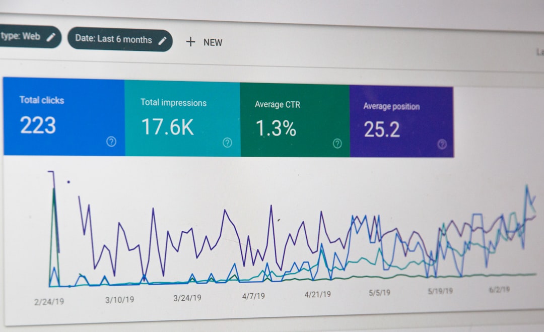
If 500 visitors view the page and 25 convert, your conversion rate is 5%. If another version gets 40 conversions from 500 visitors, that is 8%. That small design or copy change can mean many more leads without buying more traffic.
Step 10: Test one change at a time
Do not redesign the whole page after one bad week. Test carefully. Change one major item at a time, such as the headline, button text, hero image, form length, or offer.
Good tests include:
- “Get Started” versus “Get My Free Quote”
- Short form versus two-step form
- Customer photo versus product screenshot
- Discount offer versus free consultation
Let the test collect enough traffic before deciding. Ten visits do not prove much. A few hundred visits give a better signal, though higher-traffic pages can reach confidence faster.
Final checklist before you publish
- The page has one clear goal.
- The headline states a useful outcome.
- The call to action is visible near the top.
- The page loads quickly on mobile.
- The form or payment action works.
- Trust signals are visible.
- Analytics and conversion tracking are active.
- The thank-you page is ready.
A WordPress landing page works best when it is simple, fast, and focused. Start with one offer. Build the page around the user’s next step. Then measure, adjust, and improve based on real behavior instead of guesswork.