
A website redesign can look impressive in a portfolio, but the real measure of success is what happens after launch. Strong before-and-after examples show how changes to structure, messaging, speed, navigation, and visual hierarchy can turn a confusing site into a clearer, more profitable digital experience.
TLDR: The best website redesigns do more than modernize visuals; they improve measurable outcomes such as conversion rates, engagement, search visibility, and customer trust. Before-and-after examples reveal how strategic changes to layout, content, performance, and calls to action create real business impact. A successful redesign begins with evidence, not guesswork, and ends with results that can be tracked.
Why Before-and-After Website Redesign Examples Matter
Before-and-after comparisons are valuable because they make improvement visible. A redesign may involve new colors, cleaner typography, updated photography, and improved mobile responsiveness, but those changes only matter when they solve actual user problems. The strongest examples connect design decisions to outcomes such as more leads, more sales, longer session duration, or lower bounce rates.
In many cases, the “before” version of a website suffers from familiar issues: crowded pages, weak messaging, slow loading times, unclear navigation, outdated branding, or a checkout process with too many steps. The “after” version succeeds because it removes friction. It helps visitors understand the offer faster, find information more easily, and complete important actions with less effort.
A redesign is not simply a cosmetic refresh. It is a structured effort to improve how a website performs for both users and the business behind it.
Example 1: Service Business Site With Weak Lead Generation
A local home services company had a website that looked outdated and gave visitors little reason to take action. The homepage opened with a large stock image, vague copy, and a small phone number in the header. Service pages were thin, testimonials were buried, and the contact form appeared only on one page.
Before the redesign:
- The primary call to action was difficult to find.
- Service descriptions were generic and did not explain customer benefits.
- The site loaded slowly on mobile devices.
- Trust signals, such as reviews and certifications, were hidden.
After the redesign: the company introduced a clear hero section with a specific value proposition, prominent phone and quote buttons, shorter forms, stronger service landing pages, and visible customer reviews. The redesigned site also grouped emergency services, routine maintenance, and installation services into simple navigation categories.
The result was a noticeable increase in quote requests and phone calls. Mobile visitors, who previously left quickly, began engaging with service pages because the redesign made urgent information easy to access. The site did not become more effective because it was flashier; it became more effective because it answered questions faster.
Example 2: Ecommerce Store With Cart Abandonment Problems
An online retailer selling specialty products had strong traffic but disappointing sales. Analytics showed that shoppers viewed products, added items to the cart, and then abandoned checkout. The old design featured inconsistent product photography, long product descriptions without scannable highlights, and a checkout process that required account creation before purchase.
Before the redesign:
- Product pages lacked clear benefit summaries.
- Shipping costs appeared late in checkout.
- Customers were forced to create accounts.
- Trust badges and return information were not visible near purchase buttons.
The redesign focused on reducing hesitation. Product pages gained larger images, concise bullet points, size guides, customer reviews, and stronger “add to cart” buttons. Checkout was simplified into fewer steps, guest checkout was added, and shipping information appeared earlier. The navigation was also reorganized around shopping intent rather than internal product categories.
After the redesign: the store saw a higher conversion rate, fewer abandoned carts, and increased average order value. These results came from addressing practical barriers. Customers did not need more visual decoration; they needed confidence, clarity, and fewer interruptions between interest and purchase.
Example 3: B2B Website With Confusing Messaging
A software company had invested heavily in content, but visitors still struggled to understand what the product did. The homepage used technical language, the product pages focused on features instead of outcomes, and case studies were not connected to relevant industries. The design looked professional, but it failed to communicate value quickly.
Before the redesign: visitors encountered abstract headlines, dense paragraphs, and multiple competing calls to action. The sales team reported that prospects often entered calls with basic questions the website should have already answered.
After the redesign: the homepage opened with a direct explanation of the product, the audience it served, and the main business problem it solved. The site added industry-specific pages, comparison sections, demo request prompts, and proof points such as metrics from customer success stories.
The company also replaced long blocks of copy with clear sections: problem, solution, benefits, integrations, security, pricing guidance, and next steps. This structure helped prospects qualify themselves before contacting sales. As a result, demo requests improved in quality, and the sales cycle became more efficient.
This type of redesign proves that better messaging can be just as important as better visuals.
Example 4: Nonprofit Website With Low Engagement
A nonprofit organization had a mission-driven website, but visitors were not donating, volunteering, or signing up for events at the expected rate. The old website included heartfelt stories, yet the content was scattered across many pages. Donation buttons were inconsistent, and impact data was difficult to find.
Before the redesign:
- The mission statement was clear, but action steps were not.
- Donation pages required too many fields.
- Impact statistics were hidden in annual reports.
- Event and volunteer opportunities were hard to locate.
The redesigned website placed emotional storytelling and measurable impact side by side. The homepage featured a concise mission statement, a strong donation call to action, real beneficiary stories, and simple statistics showing how contributions were used. Volunteer pages became easier to browse, and donation forms were shortened.
After launch, the organization saw stronger engagement with donation pages and volunteer signups. The improvement came from aligning inspiration with action. Visitors who felt moved by the mission could immediately see what to do next.

Example 5: Publishing Site With Poor Readability
A media and publishing website had a large archive of useful articles, but readers were not staying long. The old design relied on small type, intrusive ads, cluttered sidebars, and weak internal linking. Search traffic was healthy, yet repeat engagement was low.
Before the redesign: readers landed on articles but quickly left. The page layout made reading tiring, related content was not obvious, and newsletter signup prompts appeared at awkward moments.
The redesign improved typography, spacing, article structure, and content discovery. Articles gained clearer headings, better image placement, summary boxes, and related reading sections. Ads were repositioned to reduce disruption, and newsletter prompts became more contextual.
After the redesign: average time on page increased, pages per session improved, and newsletter subscriptions rose. The redesign did not change the core content; it changed how comfortably and logically that content was experienced.
Common Redesign Changes That Produce Real Results
Across successful before-and-after examples, several patterns appear repeatedly. These improvements may seem simple, but they often have a direct effect on performance.
- Clearer value propositions: Visitors understand the offer within seconds.
- Stronger visual hierarchy: Important messages, buttons, and proof points stand out.
- Improved mobile experience: Pages load faster and function better on smaller screens.
- Simplified navigation: Visitors find products, services, and support information faster.
- Better calls to action: Buttons use specific language and appear in logical places.
- More trust signals: Reviews, case studies, certifications, guarantees, and security notes reduce uncertainty.
- Faster performance: Optimized images, cleaner code, and better hosting reduce load times.
- Content restructuring: Pages become easier to scan, compare, and act on.
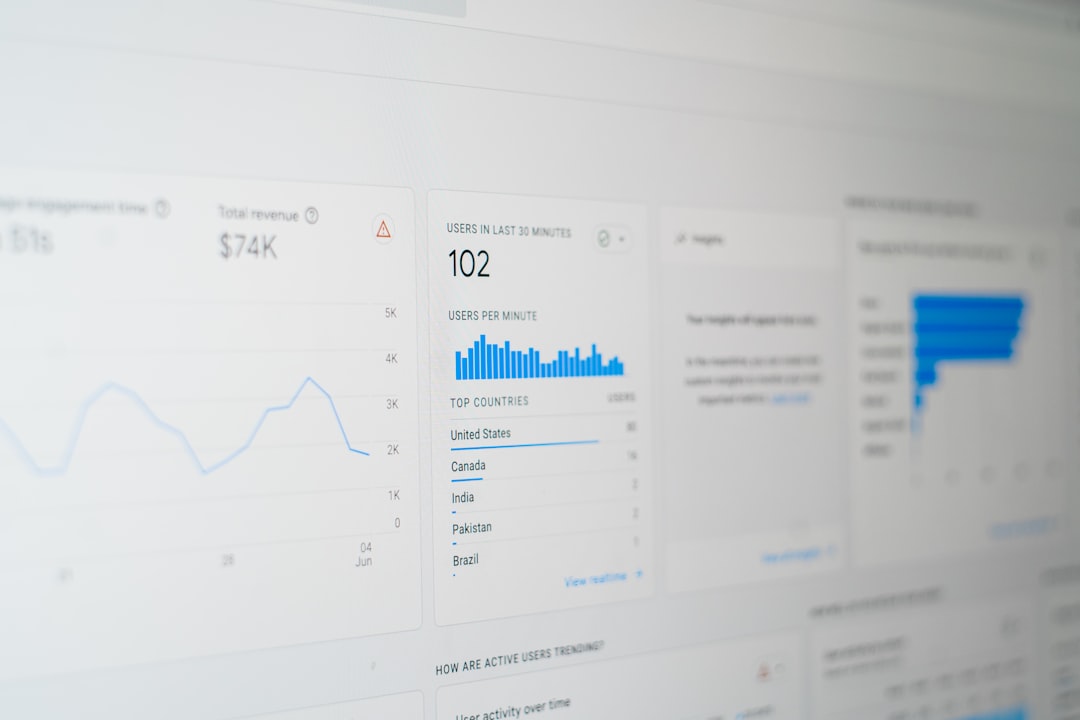
How Results Should Be Measured After a Redesign
A redesign should be evaluated with data, not opinion alone. While stakeholders may prefer the new visual style, measurable results show whether the redesign truly helped. Comparing performance before and after launch allows teams to identify what improved and what still needs attention.
Common metrics include:
- Conversion rate: The percentage of visitors completing key actions.
- Lead volume: The number of form submissions, calls, bookings, or demo requests.
- Revenue: Sales, average order value, and customer acquisition performance.
- Bounce rate: The percentage of visitors leaving without further interaction.
- Engagement: Time on page, pages per session, downloads, and video views.
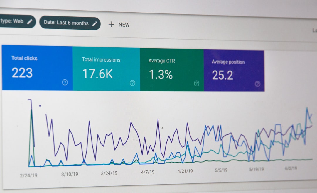
- Search performance: Rankings, impressions, clicks, and organic traffic quality.
- Page speed: Load time, Core Web Vitals, and mobile usability.
For accurate analysis, teams usually compare similar time periods and account for seasonality, advertising changes, and market conditions. A redesign launched during a major campaign may appear more successful than it really is unless traffic sources are considered.
What the Best Redesigns Have in Common
The most successful redesigns begin with research. Teams review analytics, heatmaps, search data, customer feedback, support questions, and competitor positioning. They identify friction before proposing visual solutions. This makes the redesign more strategic and less subjective.
They also prioritize users. A business may want to showcase its full history, awards, and internal structure, but visitors usually care about their own goals first. They want to know whether the company can solve their problem, how much effort is required, and why it can be trusted.
Finally, successful redesigns continue after launch. The new website becomes a stronger foundation for testing headlines, forms, page layouts, and offers. Instead of treating launch day as the finish line, high-performing teams treat it as the beginning of ongoing optimization.
FAQ
What is a website redesign before-and-after example?
A website redesign before-and-after example compares an older version of a site with its improved version. It usually highlights changes in design, content, structure, usability, and measurable results such as conversions, traffic, or engagement.
How long does it take to see results after a website redesign?
Some results, such as improved speed or higher form submissions, may appear within days or weeks. Search engine performance and broader conversion trends often require several months of data to evaluate accurately.
What makes a website redesign successful?
A successful redesign improves both user experience and business outcomes. It should make the site easier to use, clearer to understand, faster to load, and more effective at encouraging important actions.
Can a redesign hurt website performance?
Yes. A redesign can hurt performance if it removes valuable content, changes URLs without redirects, slows down pages, or focuses on style over usability. Careful planning, testing, and search engine optimization help reduce this risk.
Which pages should be redesigned first?
High-impact pages should usually come first. These often include the homepage, product or service pages, pricing pages, checkout pages, contact pages, and landing pages that receive significant traffic.
How should a company prepare for a redesign?
A company should review analytics, define goals, audit existing content, collect customer feedback, study competitors, and identify the main barriers users face. This preparation helps ensure the redesign is based on evidence rather than personal preference.