Dots are tiny. But in print design, they can shout. Halftone color effects turn simple dots into bold posters, comic-style art, retro textures, and modern visual drama. They are fun, flexible, and surprisingly easy to understand.
TLDR: Halftone effects use dots to create color, shade, and texture. They can make a poster feel vintage, futuristic, loud, or handmade. For example, a music venue could use a red and blue halftone portrait on 500 event posters and make the design feel more energetic without adding extra colors. In print tests, large halftone dots often stay clearer from 2 meters away than soft gradients, especially on rough paper.
What Is a Halftone Effect?
A halftone effect is a pattern of dots. These dots vary in size, spacing, color, or angle. Together, they trick the eye into seeing tone and depth.
Think of an old newspaper photo. Up close, it looks like dots. From far away, it looks like a photo. That is halftone magic.
In poster and print design, halftones are not just a technical trick. They are a style. They add grit. They add movement. They add charm.
Small dots can feel soft. Big dots can feel loud. Uneven dots can feel raw and handmade.
Why Designers Still Love Halftones
Halftones have been around for a long time. Yet they still feel fresh. That is because they sit between two worlds.
- They feel retro. They remind people of comics, old ads, and screen prints.
- They feel modern. Bright colors and bold layouts make them look new again.
- They print well. Dots can handle ink limits better than soft gradients.
- They add texture. Flat artwork gets instant character.
A flat yellow background is fine. A yellow halftone fade feels alive. A plain portrait is useful. A halftone portrait has attitude.
The Basic Idea: Dots Create Shade
Halftones work with a simple rule. Bigger dots look darker. Smaller dots look lighter.
If dots are close together, the area feels heavy. If dots are far apart, the area feels airy. Your eye blends them from a distance.
This is why halftones are great for posters. Posters are often seen from across a room or street. The dots create strong shapes first. Then, as people get closer, they notice the texture.
Modern Technique 1: Big Pop Art Dots
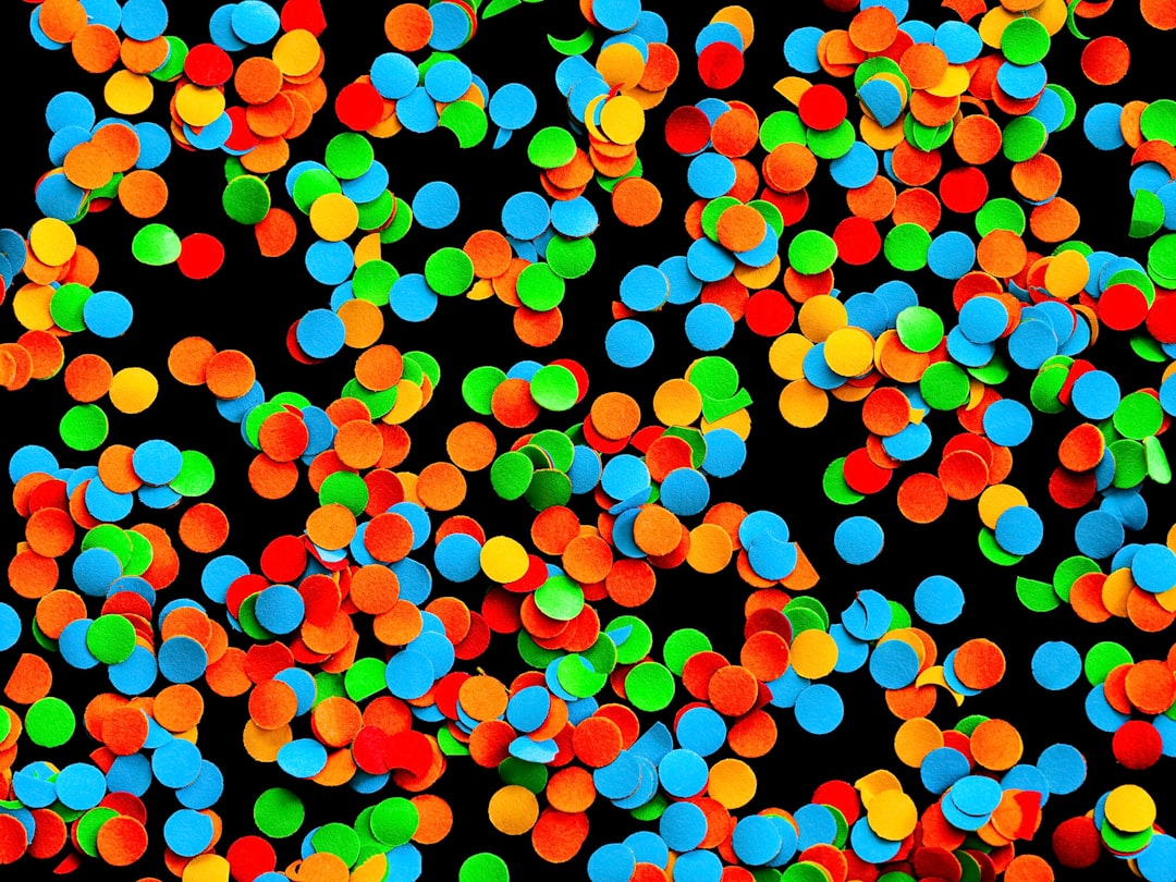
This is the classic fun look. It feels like comic books, candy wrappers, and bold magazine covers.
Use large round dots. Use bright colors. Keep the layout simple.
Try this:
- Use a strong portrait or object.
- Add red, yellow, blue, or pink dot patterns.
- Pair it with thick black type.
- Leave some clean space so the dots can breathe.
This style works well for concerts, art fairs, food events, and fashion posters. It says, “Look at me!” without being too serious.
Modern Technique 2: Gradient Halftones
A gradient halftone changes from big dots to small dots. It can fade from dark to light. It can also fade from one color to another.
This effect is smooth, but still textured. It is perfect when you want energy without clutter.
Use it behind a headline. Place it around a product. Let it move across the page like light or smoke.
For print, keep the smallest dots large enough to survive. Very tiny dots may disappear on rough paper. A safe test is simple. Print a small sample at real size before making the full run.
Modern Technique 3: Color Channel Misalignment
This one is playful. It uses color layers that do not line up perfectly.
Imagine a face printed in cyan, magenta, and yellow. Now shift one color slightly to the left. Shift another slightly down. Suddenly, the image vibrates.
This creates a bold screen print feel. It can also look like an old 3D poster. The effect feels human because it is imperfect.
But do not push it too far. If the shifts are too large, the design can look messy. A small move is often best. Try 2 to 6 millimeters on a poster, depending on size.
Modern Technique 4: Duotone Halftones
Duotone means using two main colors. Add halftone dots, and the result can feel very stylish.
For example, use deep navy and hot orange. Or dark green and cream. Or purple and lime.
Duotone halftones are great when you have a limited print budget. They can look rich with only two inks. That means less cost and fewer production problems.
They also work well for brand posters. You can keep the design inside a color system while still making it feel fresh.
Modern Technique 5: Rough Screen Print Texture
Not all halftone dots need to be perfect circles. Some can look rough. Some can look broken. Some can look like ink pushed through a screen.
This style feels handmade. It is great for music posters, skate graphics, protest posters, zines, and indie events.
To get this look, add grain. Distort the dot edges. Use uneven ink coverage. Let small gaps appear.
The goal is not clean perfection. The goal is energy.
Modern Technique 6: Mixed Dot Shapes
Dots do not have to be dots. Modern halftones can use many shapes.
- Circles for a classic look.
- Squares for a digital feel.
- Lines for a scan effect.
- Stars for playful posters.
- Organic blobs for handmade texture.
Shape changes can transform the mood fast. A circle halftone feels friendly. A square halftone feels techy. A line halftone feels fast and sleek.
Use shape with purpose. Do not pick a star pattern just because it is cute. Unless the poster is for a disco night. Then yes. Use the stars.
Color Tips for Better Halftone Posters
Color is where halftones get exciting. But it can also get wild fast. Here are simple rules.
- Limit your palette. Use 2 to 4 main colors.
- Use contrast. Light dots on dark colors can pop.
- Test overlays. Blue over yellow may create green.
- Watch skin tones. Heavy dots can make faces look dirty.
- Think from far away. Posters must read at a distance.
If your design looks good as a small thumbnail, it will probably work as a poster. If it becomes a noisy soup, simplify it.
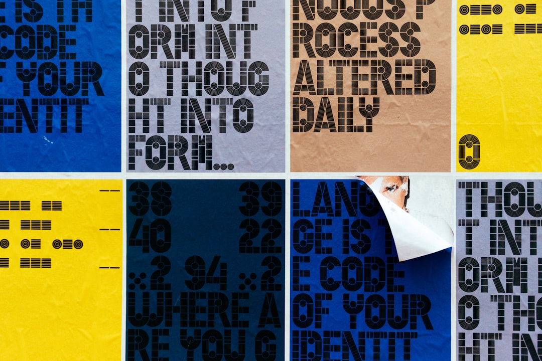
Typography and Halftones
Type and halftones can be best friends. But one of them should lead.
If the background is full of dots, keep the type bold and clean. If the type has halftone texture, keep the background simple.
Big sans serif fonts work well. Chunky display type works too. Thin type can get lost in busy dots.
Try placing a halftone fade inside large letters. Or let dots break away from the edge of a word. This gives the text motion.
Just remember the main job of a poster. People need to read it fast.
Print Design Checks Before You Send the File
Halftone effects can look different on screen and paper. So check your files before printing.
- Print at actual size. A small preview can lie.
- Check dot size. Tiny dots may fill in or vanish.
- Use the right color mode. Many print jobs need CMYK.
- Ask about paper. Coated paper holds detail. Uncoated paper softens it.
- Watch ink coverage. Too much ink can look muddy.
A rough paper can make halftones feel warm and vintage. A glossy paper can make them sharp and loud. Neither is better. They just tell different stories.
A Simple Poster Recipe
Want to try a halftone design today? Use this easy recipe.
- Pick one strong photo or object.
- Convert the shadows into halftone dots.
- Choose two bold colors.
- Add one large headline.
- Leave one clean area for details.
- Print a test.
That is enough. You do not need twenty effects. One strong halftone idea can carry the whole poster.
Final Thoughts
Halftone color effects are more than old print technology. They are a design playground. They can be loud, soft, polished, rough, retro, or futuristic.
The best part is simple. Halftones make flat designs feel alive. They add rhythm. They add texture. They make people look twice.
So start with dots. Then push them. Stretch them. Color them. Break them a little. Your next poster might begin with one tiny circle and end with a big visual bang.